Posted By

Csabo
on 2023-09-17
16:13:39
|  Re: Into the Eagles Nest color correction Re: Into the Eagles Nest color correction
Work on this is underway. I'm going to ramble on about this for a while, maybe just to wrap my own head around it.
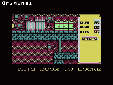
First thing is getting the colors right, which involves adjusting every single item, the walls, enemy sprites, etc. Here's the current progress (still needs work):
 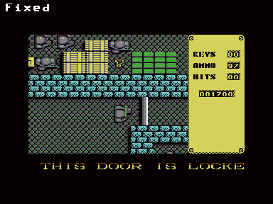 
And the same thing animated:

The two major multicolor colors are two shades of gray. Once this is set correctly, one can see that basically everything in the Plus/4 version was colored wrong :-/ I think Mucsi must have used a black-and-white TV at this time, it's hard to imagine them not seeing how atrocious the colors look.
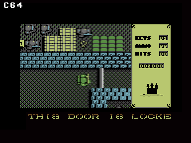
We have to commend him for the way the sprite was handled though. In the original, everything is done from the charset, with two exceptions: the player, and the little castle at the bottom of the status bar. Mucsi re-used the enemy soldiers as the player sprite, which is "good enough" to make the game work, I guess. His code is a bit slow, which causes the player sprite to flicker when the player walks "up" to the middle of the screen. I've optimized this part already which got rid of the flicker.
While this solution "works", the player is not at all visually distinct from the enemy soldiers, and I would really like to improve this. However, drawing new characters for the player is out of the question, there isn't enough room in the charset. I was mulling this over how to deal with this, and I had the idea of re-drawing the enemy soldiers, so that the majority of the color is taken up by the "per character" color (NOT the two multicolor grays, which are fixed for the entire screen). This would allow each soldier to be colored individually, so the enemies could remain gray (but the little cyan/yellow highlights), but the player would be green.
However... as I was exploring the levels, I came across the prisoner we're supposed to free... and what do you know! He's green! Here's a screenshot with the prisoner (in all his green glory) following the player:
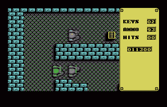
That's great news for us, my current thinking is that I will rewrite the sprite conversion to use the "prisoner" characters instead. I wonder why Mucsi didn't do it that way.
That's basically the current state, there's a LOT of work left. A couple of weird things I found:
- In the MB version, the colors for the programmer/graphician are swapped for some reason. It's really odd, it's not due to some color mapping, I honestly can't imagine how that happened.
- Other than the misspelled "destrayed" message (which is "destroyed" in the original), there's other odd bugs in the Plus/4 version. For example, on the first floor's map, a little up/right from the starting position, there are two "garbled" squares, which are simply just "floor" in the original. (Fixing that is on my to-do list.)
- In the original, there are definitely several things that need fixing. For example, the right side yellow panel makes no sense in multicolor. On the above screenshot, you can see that I kept it hires. The vase looks awful, they seem to have messed up the colors. The cold food item in the intro section isn't colored correctly. Those are minor issues.
Other than getting the colors right, I also want to improve the sound and music (those will probably be completely reprogrammed), and add a proper trainer menu. Once it's good enough (probably at least a week, I guess), I will need some help with testing, so let me know if you want to help with that.
|