Posted By

MMS
on 2018-11-07
17:58:25
 |  Re: A new picture called Neon Nights... Re: A new picture called Neon Nights...
Thank you all for the kind words, I am really happy if you liked it 
Well, I recently listened to some Synthwave and dark Synthwave music on Youtube.
I started to like the 80s retro bright ( ) fontsets and wireframe cars and GFX.
I remember my father had a synthpop LP bought in Jugoslavia, and Next to Yazoo, Police and JMJ he listened it to the most
I liked so much the wireframe art on it as a kid. That LP wireframe art looked so modern...
But I completely forgot the band's name.
Then three weeks ago I hear the song in an 80s YT collection, and BANG, I had all my memory came back, remember the album name and so.
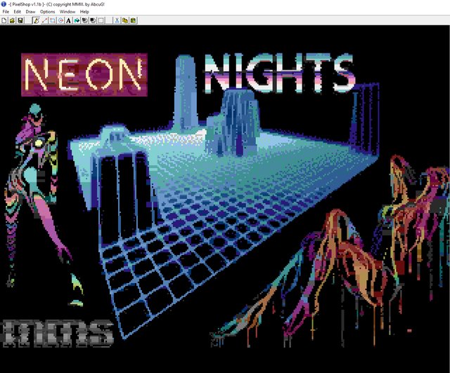
I knew I want this wireframe graph in as a center (maybe bigger), and planned some girls are partly hidden behind the wireframe towers, amd just looking out to you, but was not possible with HIRES (for me), and they even looked too small. Especially with Multi I was not happy with the resolution.
I knew, that I want something with neon and naked girls, so that's how the name came, and started googleing and looking for nice loyalty free legal arts.
Fontsets came easy from the Neon and "retro futuristic" search.
It was a really warm feeling to create it, as I feel the 80s were so much better (and naive) than the today cruel world. I know it is not true, I was just a kid, but wanted to put that dreamful, optimistic future view feeling to the picture.
During creation I listened mainly to synthpop and synthwave (from Secret Service "Oh Susie" start is a great one, maybe one day a TED tune ). Usually I listen to melodic death metal. 
After I had the arts in question (and aligned with Shane some details), I created the pic with layers.
I think I had 16 or so. Not because it is a very compex pic, but more content was planned, but step by step I switched them off
All the letters in the text are on different layers to able to play with the distance (attribute limits), and made rough conversions with Istvan's converter to see the end result, how one gfx influences the others next to them. (attribute clash)
I think I have 15 version alltogether, mainly with different sized art and text.
In this case I did not make too much color reduction, palette change or other improvements, except the woman in question was originally with white background, and I needed it on black, so some repaint was required for the better colors. Because I knew I will anyhow correct it in pixel mode.
After I felt composition is OK, saved to P4S format, started AbcuG's Pixelshop, and removed bad pixels.
In several cases where the converter chose the darkest grey was not the black (looks ugly), and lightest blue or pink instead of white. Hopefully I could recolor them all, maybe not
It was like 100 attributes to manually adjust color (after a while almost automatic), and adjust pixels, but after some time it is a routine work, goes fast.
Finally some colors were really look strange on the two woman, so I made some recolor and changed their shape more recognizable removing by pixels, and made their arm and leg and bottom shape better looking.
Then the last step was convert P4S to PRG with IstvanV's program. In fact two or three versions were cancelled, as during emu check I still found some weird color issues.
It is just FYI, and maybe a small help for beginners
The HFLI editing was really required, this is the picture just after conversion:
|