| Posted By

Csabo
on 2017-03-21
21:15:01
|  Venice Carneval! Venice Carneval!
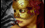
 MMS has just released a new picture show for the Plus/4. It features 12 HFLI images, all about the Venice Carneval. Check it out and read the author's notes! MMS has just released a new picture show for the Plus/4. It features 12 HFLI images, all about the Venice Carneval. Check it out and read the author's notes! |
|
Posted By

George
on 2017-03-22
21:15:01
 |  Re: Venice Carneval! Re: Venice Carneval!
Nice colorful pictures. Wonderful selection. Perfect for the plus/4. Good job MMS |
|
Posted By

MMS
on 2017-03-22
22:24:26
 |  Re: Venice Carneval! Re: Venice Carneval!
Thanks!
I collected these pictures in the last 3-4 years, and I have to tell, that 3 times more were tested and thrown away due to bad end result. (or I was just too lame to find the proper setting)
Even in the last moment 3 pictures were swapped with new ones because my kids did not like them so much (I have to agree the new ones are better)  |
|
Posted By

Csabo
on 2017-03-23
22:58:03
|  Re: Venice Carneval! Re: Venice Carneval!
Definitely nice selection of pics! |
|
Posted By

SVS
on 2017-03-26
15:15:42
 |  Re: Venice Carneval! Re: Venice Carneval!
Very nice work! Congrats MMS. |
|
Posted By

Mad
on 2017-03-26
16:50:48
|  Re: Venice Carneval! Re: Venice Carneval!
Nice collection. Some of them are exceptional. You do not need 24 bit truecolor at all  .. .. |
|
Posted By

MMS
on 2017-03-26
17:48:30
 |  Re: Venice Carneval! Re: Venice Carneval!
Thank you folks! (as you could easily notice, in some cases I was just a lazy bastard  ) ) |
|
Posted By

George
on 2017-03-27
18:03:46
 |  Re: Venice Carneval! Re: Venice Carneval!
Hi MMS,
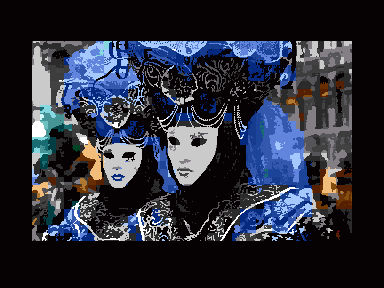
indeed beautiful, but difficult pictures for conversions. You made me curious. Here a try in my conversion style (HR mode):
 |
|
Posted By

MMS
on 2017-03-28
16:10:50
 |  Re: Venice Carneval! Re: Venice Carneval!
Yeah George, this one is really challenging due to the very fine details on the blue patterns, while the mask with become very much dithered when you try to play with the blue areas. Your one still looks nice here.
The buildings on the backgound with "out of focus" sometimes caused "ditheringus maximus"  , but in your case they are fully recognizable too. , but in your case they are fully recognizable too.
BTW I tried out the dithering free mode too, if you check the Clown with the Golden mask, it was made with that setting. Maybe I was a little too optimistic on the end result, or was too late or drunken to notice the defectst 
It is interesting, how hard to get proper greens and blues, while golden color looks fantastic. While generally speaking the 9 shades of gray of Plus/4 sounds great on paper, all pictures with bigger white/middle grey areas really sucked. I had two or three pictures, all were cancelled, despite major efforts in the editor. I think we really miss the 16 greys (and a REAL white) potentially was in the TED hardware design.
Still, I do not own and do not apply +4 palette on the pictures before conversion, but typically reduce the color depth to 32, 48 or 64 independent colors, then apply a median filter with the lowest setting to reduce level of dithering in the final result.
I try to select and recolor to a more proper color at the areas still looks too dithered on the Gfx converter, then I switch back from the gfx editor, reload and check it on the go, if I could improve it.
It is fun, though I still need to learn a lot of efficient picture editing techniques, I spent ~4 or 5 hours with that girl on the title screen, while some other guys do a fantastic picture from zero in that time, eg. Genzoman on Deviantart typically finishes his fantastic arts in 6-7 hours  ) ) |
|
Posted By

George
on 2017-03-31
17:17:03
 |  Re: Venice Carneval! Re: Venice Carneval!
Hi MMS,
once again, your choice of the theme and pictures is really fantastic. I love them from every aspect.
As you mention "gold" really works well on the plus/4 and i would say "blue" too. I never liked "red". It has not the deep, brightness of some other consoles. On the other hand, thats the challenge, to make the best possible results within a limited frame. I wonder everytime, what is possible on the plus/4.
In my opinion, this pictures had to be made in HR with no dither, to keep all the fine details as much as possible. You get of course a loss in colors, but in this case it works surprising good and it doesn't bother me so much, if you don't know the original.
I had to make the picture in a 2-pass conversion only for the white masks, which are the central eye-catchers. I re-edited the coverted pictures and removed the false gray shades in the face, for the cost of the "nose". The rest in untouched.
I mentioned and linked your slide-show in my little plus4-blog. |
|
| |
Copyright © Plus/4 World Team, 2001-2025. Support Plus/4 World on Patreon |